Humane
Production Type
2023
Humane is a tech company excelling in AI hardware, epitomized by the AiPin—a state-of-the-art phone with a laser-projected interface, showcasing their commitment to advancing technology and enhancing AI user experiences. With the Production Type team, I designed and engineered their corporate typeface. Primarily crafted for branding and user interface applications, its compact family ensures readability in diverse settings, while the wide range of weights enhances design flexibility enhanced by the use of the variable font technology. The geometric sans-serif style lends a contemporary feel, aligning perfectly with Humane's tech-focused ethos.
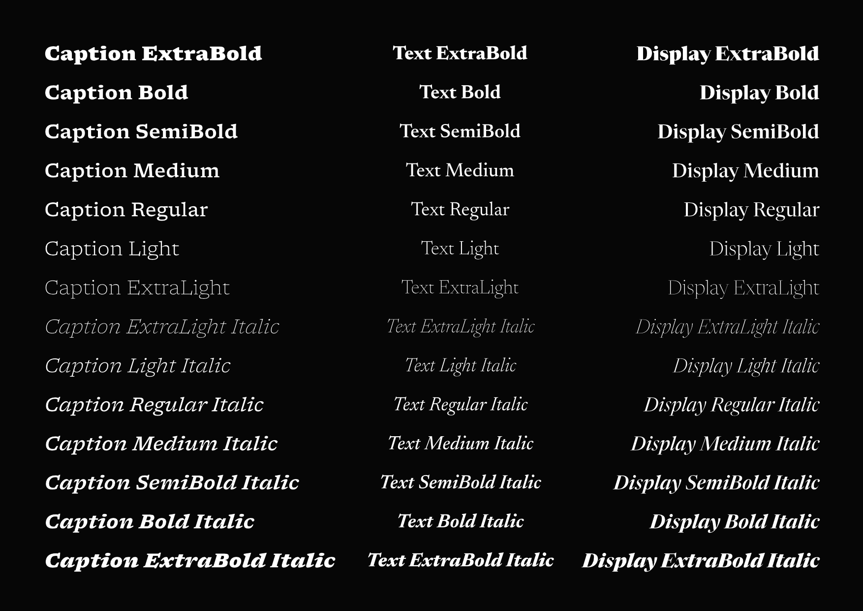


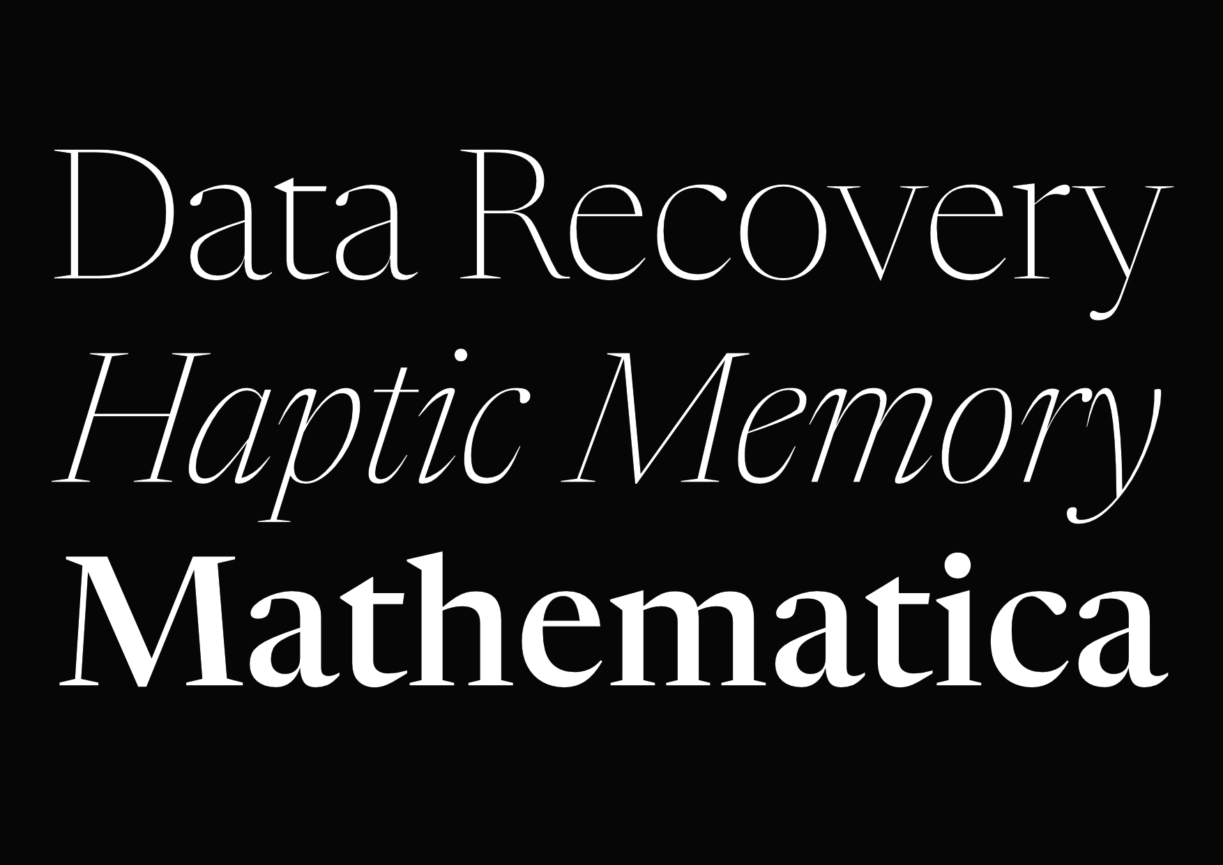
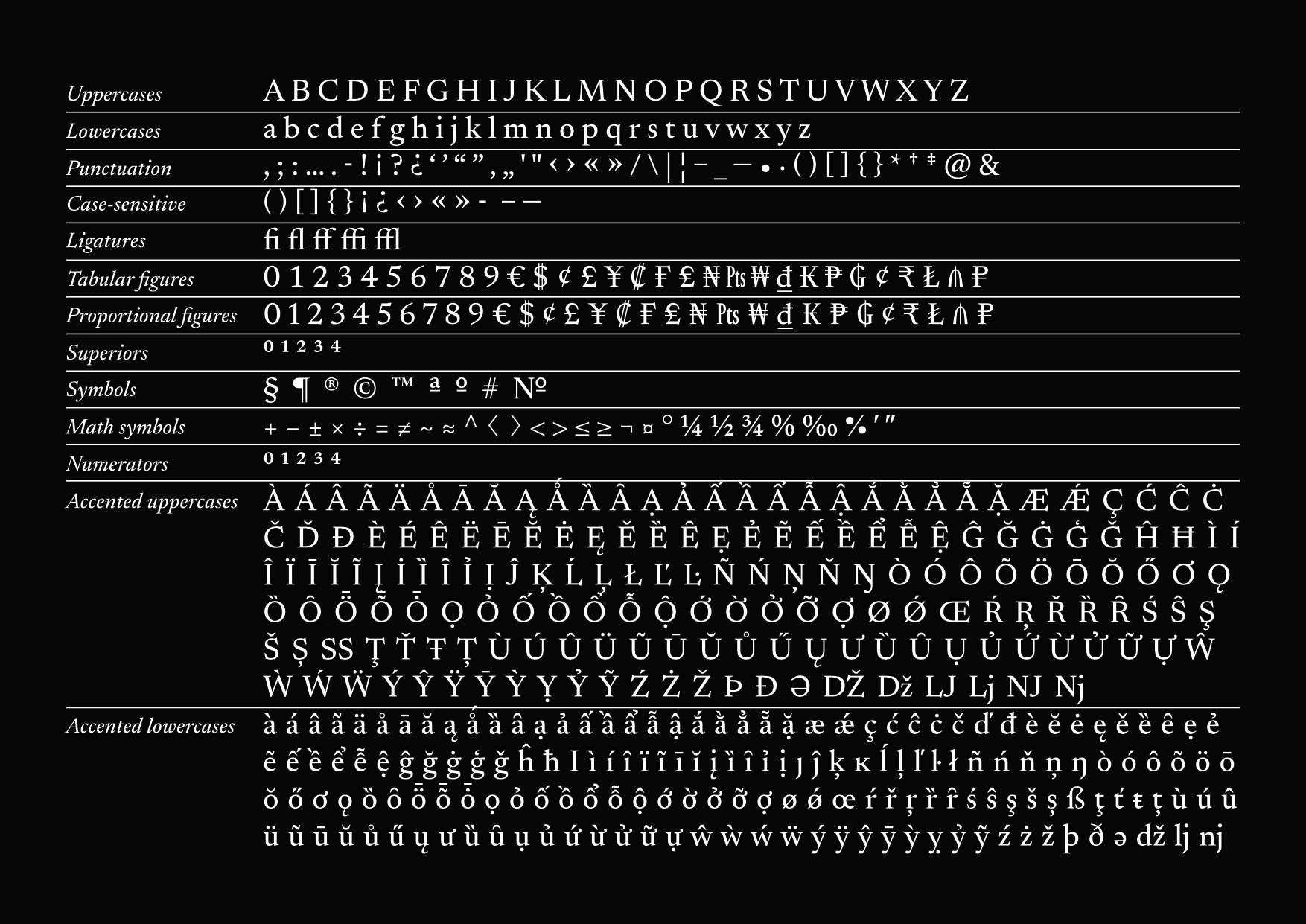
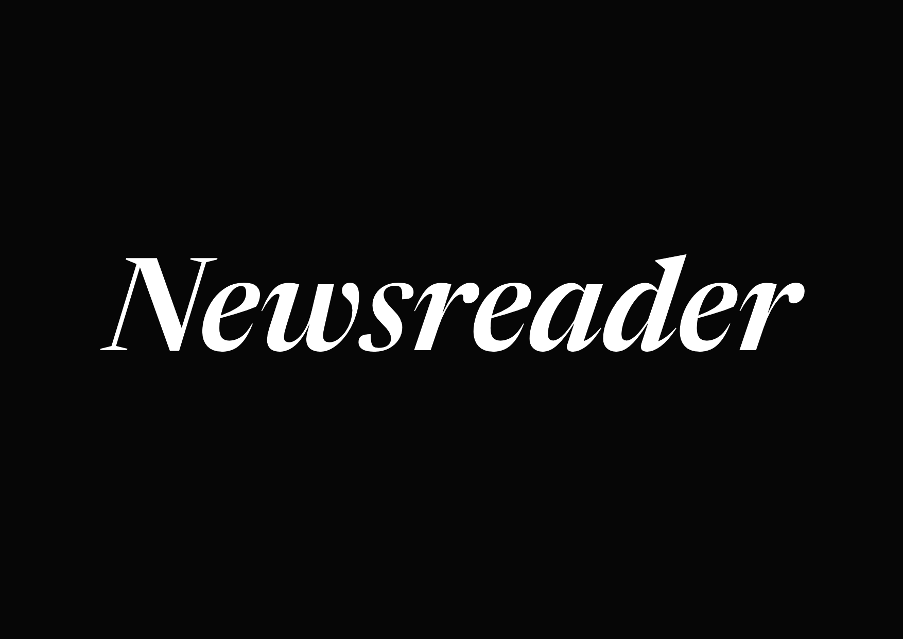
Newsreader
Production Type
2018
Newsreader is an open-source serif typeface commissioned by Google Fonts, designed for on-screen, longer-form reading. It’s a 7 weight family with matching italics spanning on 3 opticals sizes.

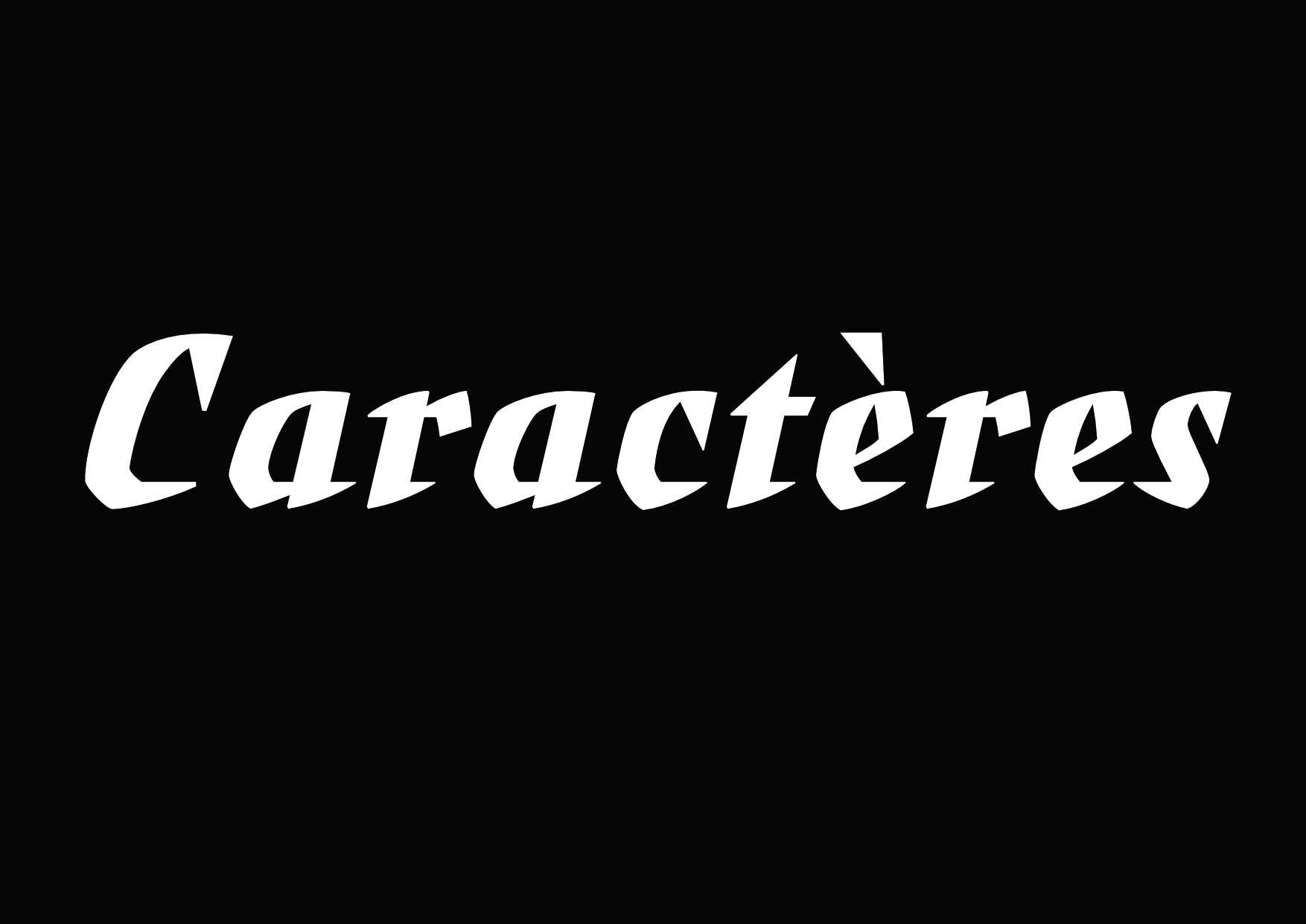
Marcel
School / Self initiated
From 2016
Work in progress display typeface extrapolated from a lettering drawn by Marcel Jacno.
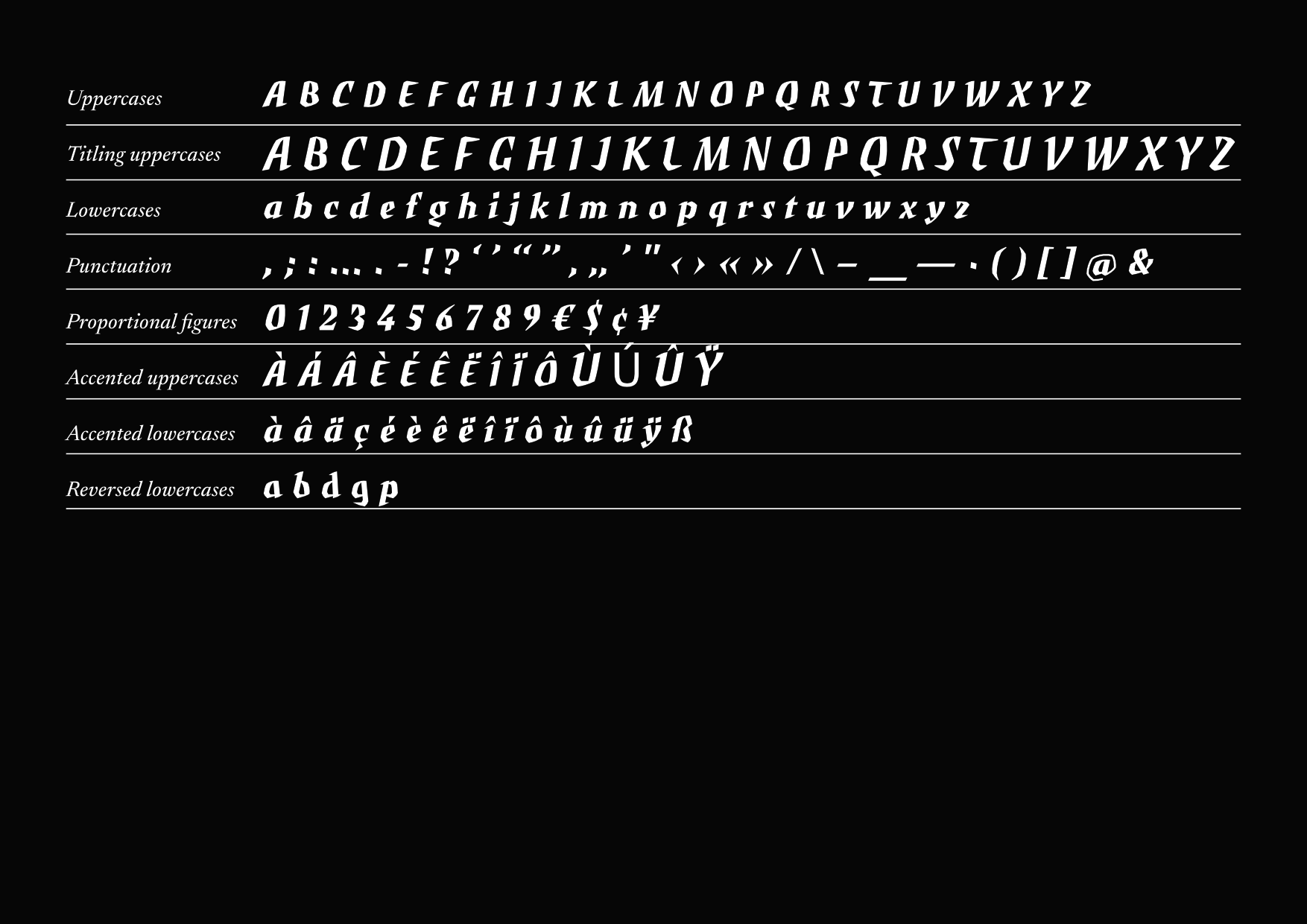
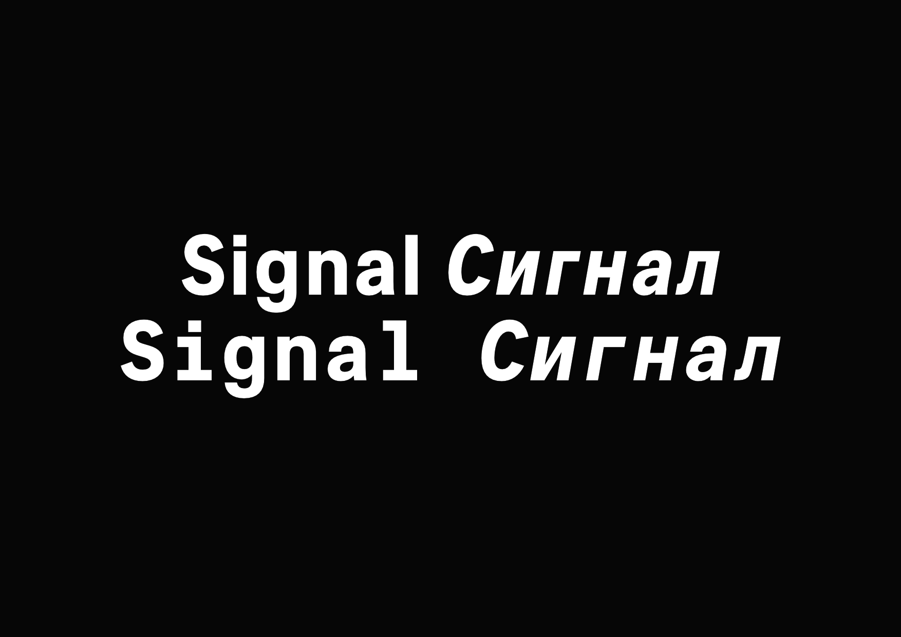
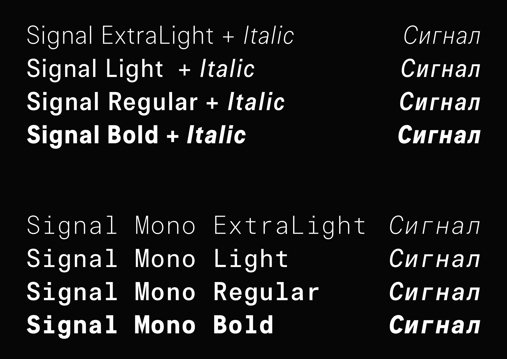
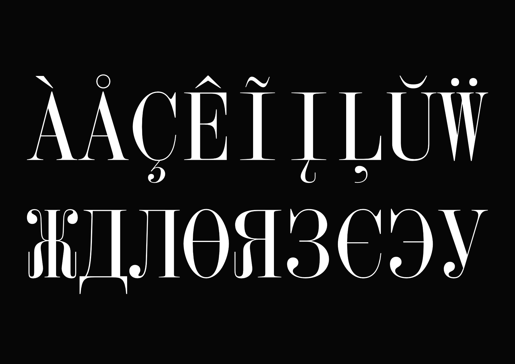
Signal
Production Type
2019-2020
After improving existing drawing, I developped the monospaced cut of the family. Under Ilya Ruderman and Yury Ostromentsky consultancy, I designed the Cyrillic both for proportional and mono.

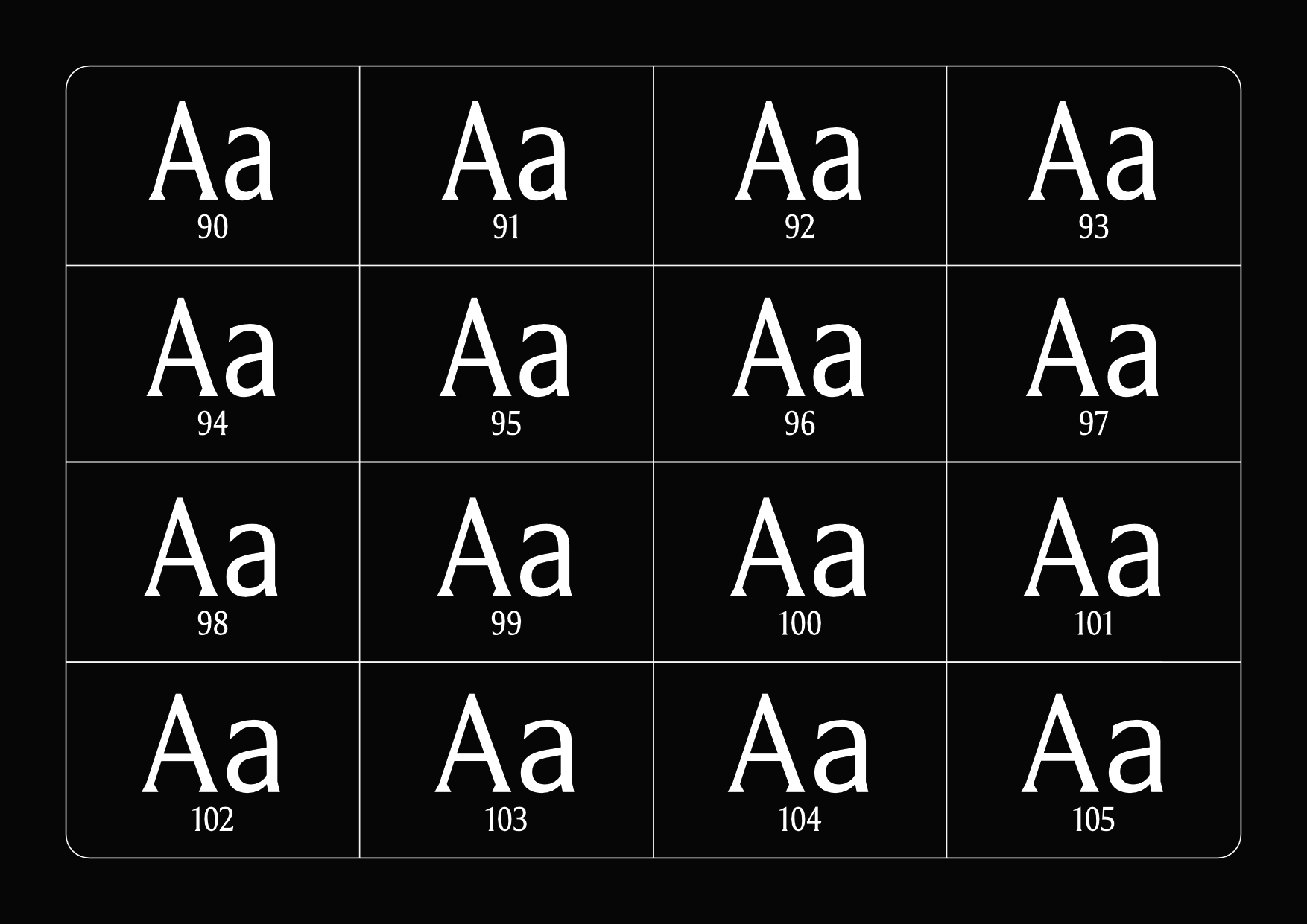
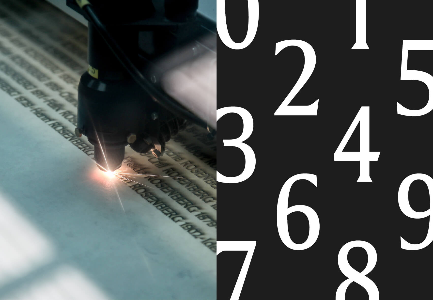
Shoah Memorial’s Wall Of Names
Production Type
2019
Designed for Shoah Memorial’s Wall of Names in Paris, a remembrance site for the Jewish genocide. Tailored for sandblasting engraving, it uses multiple width and ligatures to optimize text composition.


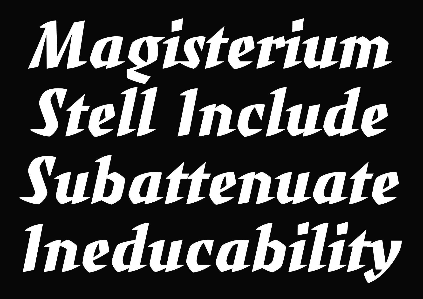
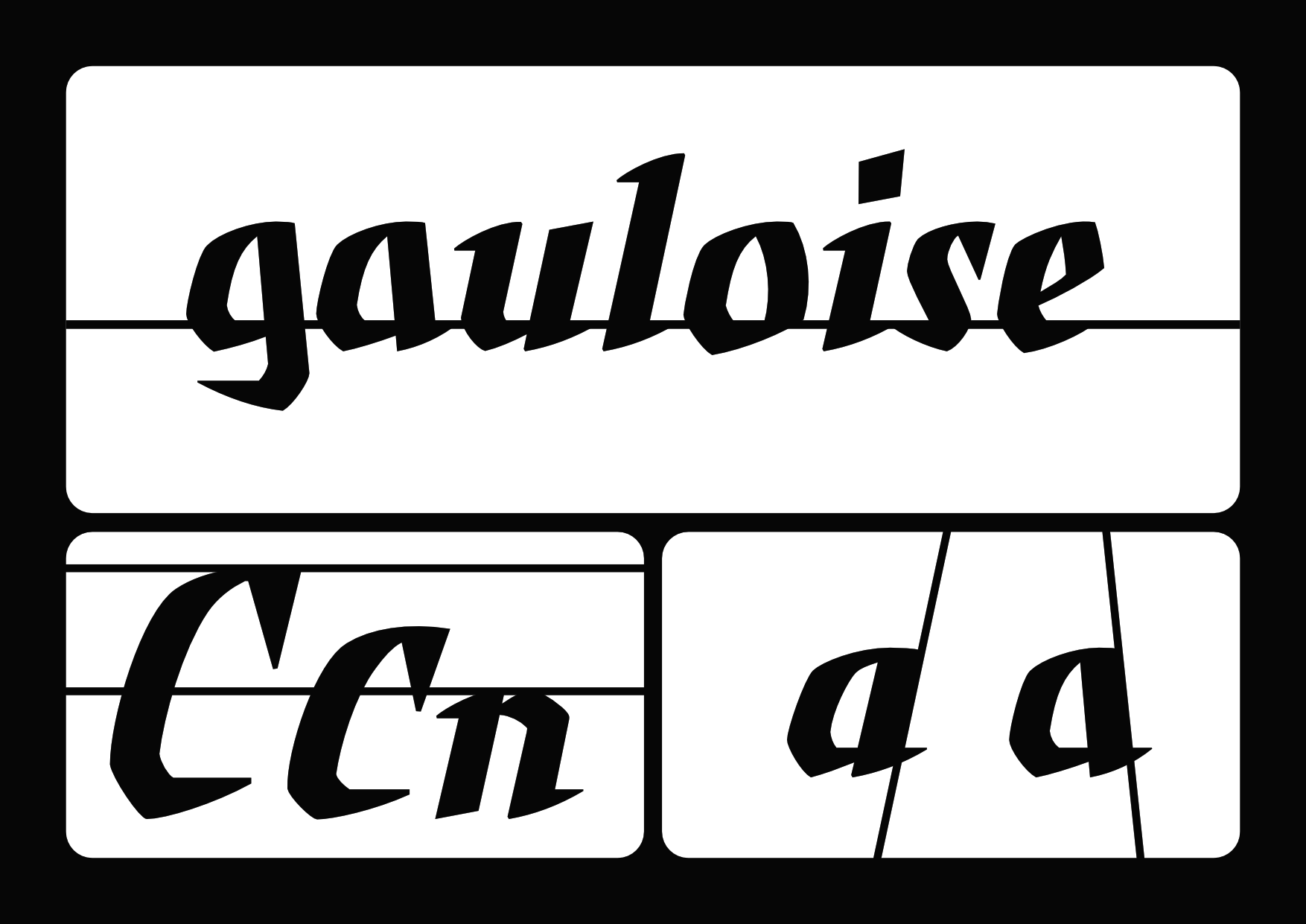
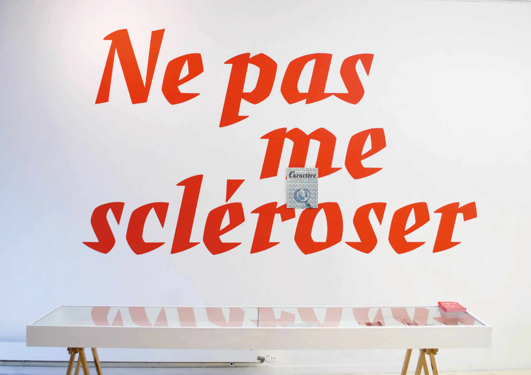
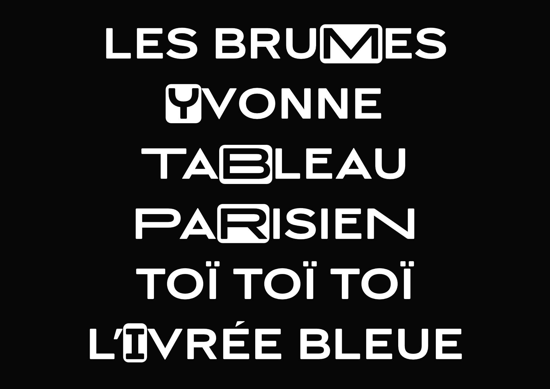
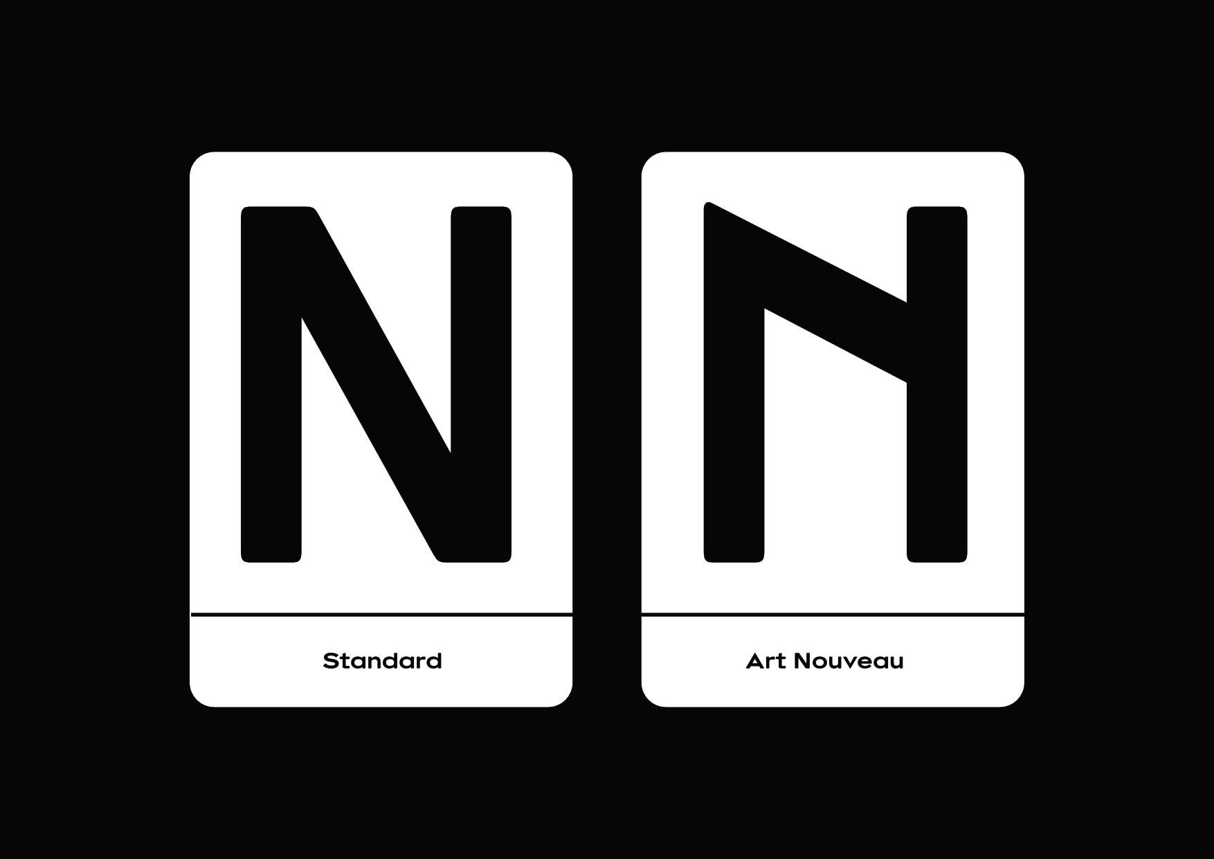
Ormaie
Production Type
2018
From the graphic designer’s sketches, I designed typeface packed with alternates to enriched the brand vocabulary. The design takes its roots in the Art Nouveau mouvement but with a more contemporary twist.


Ronaldson
Self initiated
2017
An ongoing personal take on Ronaldson typeface.


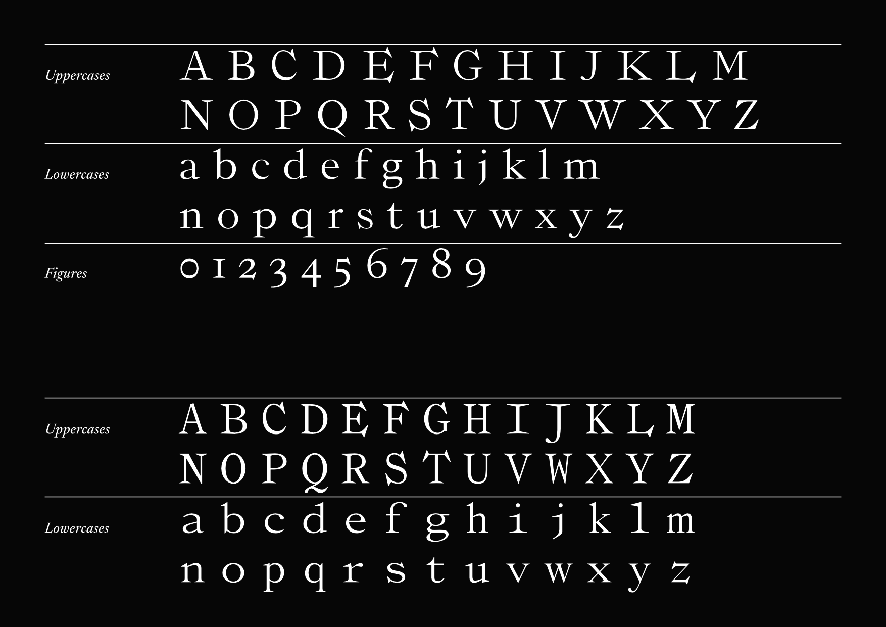
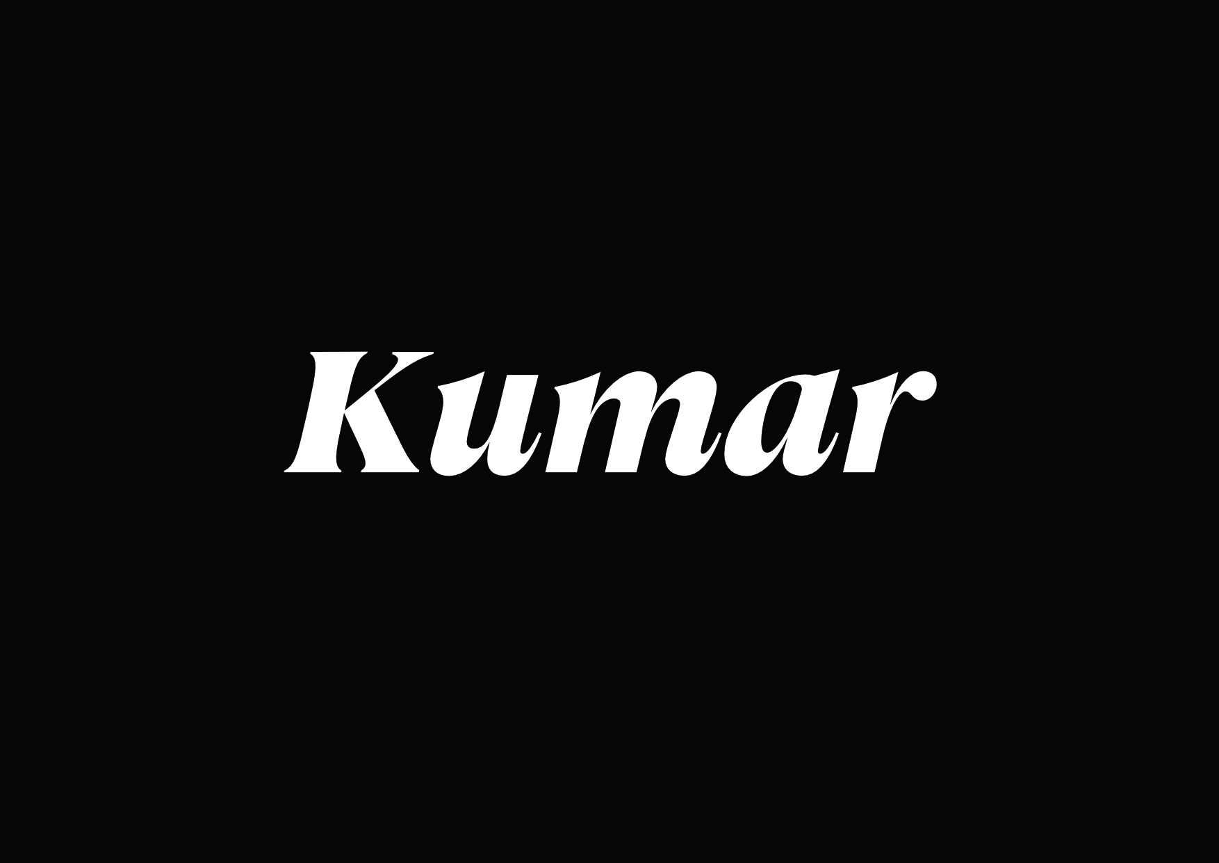
Kumar
Graduation project
2016
Kumar is a multi-script (Latin & Bengali) typeface family crafter for editorial work. Its design is inspired by late 20th cebtury Dutch type design while its proportions are reminiscent of early William Caslon work.


Generic
Police Studio
2017
Generic is a 7 weights extended lightly contrasted sans serif designed with Arthur Alazard. Its design emphasize an horizontal rythm with flat terminals which is pushed to its maximum in the heaviest weight.


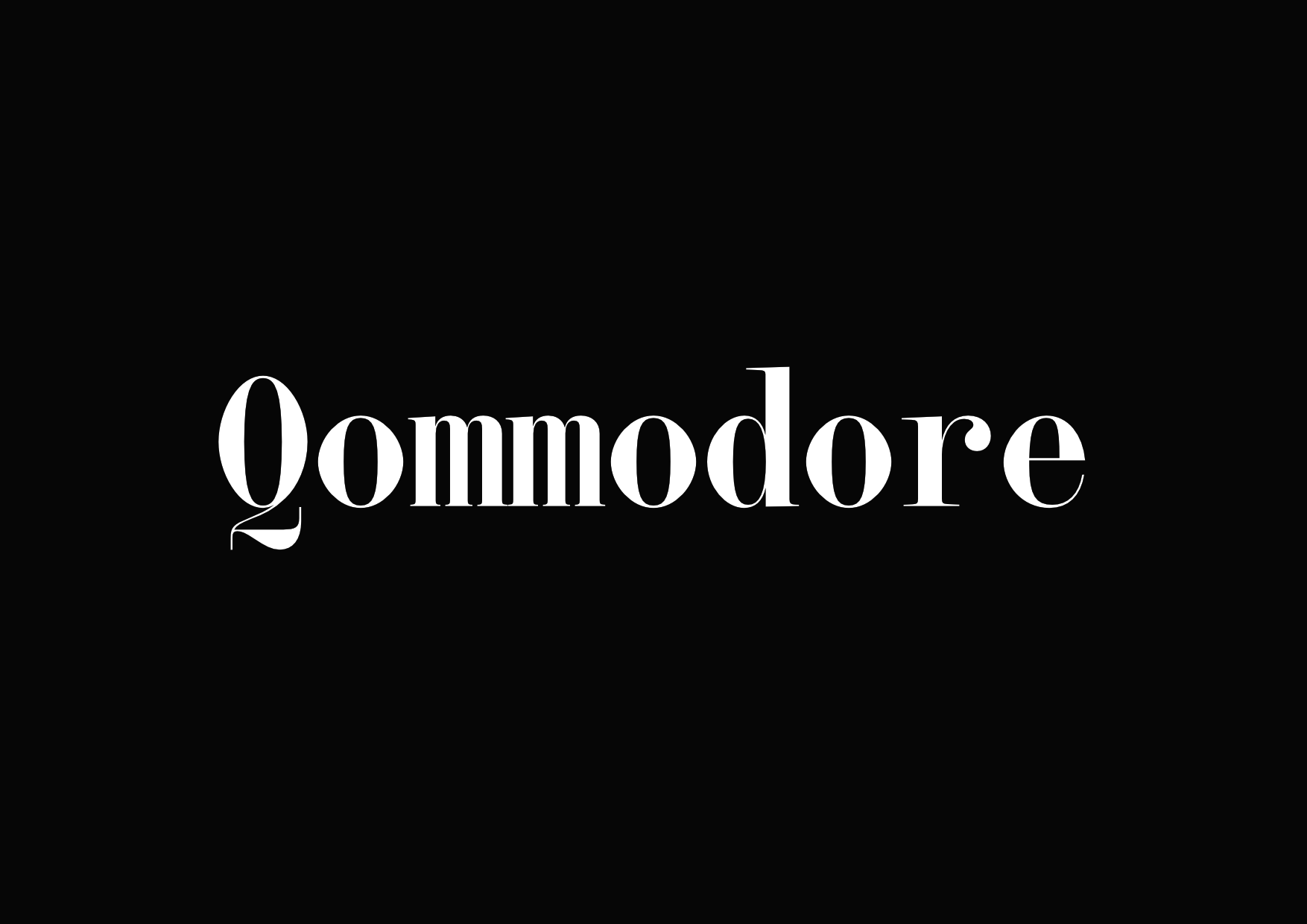
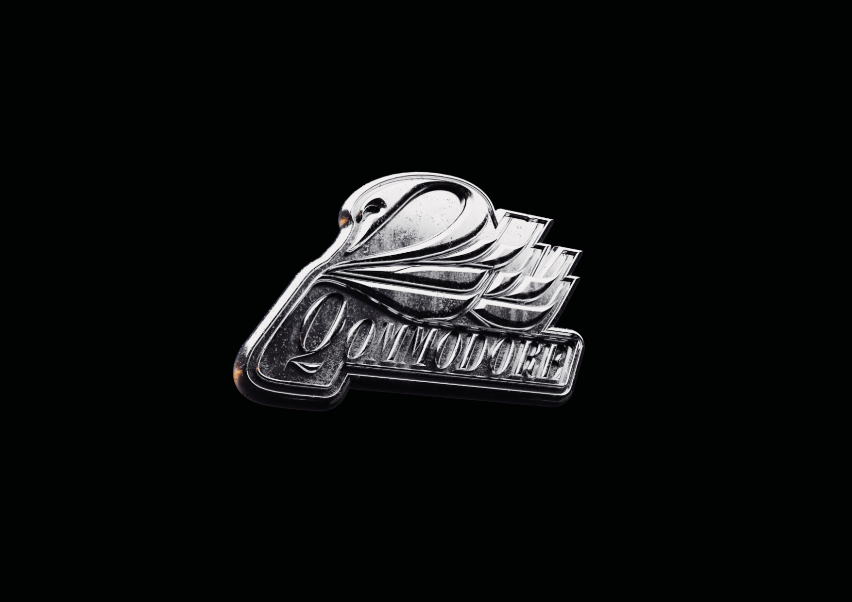
Qommodore
Production Type / Self-initiated
2023
This monospace typeface takes it’s roots from scotch typefaces from the 20th century. It balances those influences with the rational of a true monospace design. Available at Production Type


Production Type Retail Work
Production Type
2017 – Current
At the heart of my role was the responsibility of curating and advancing the typeface retail catalog, a task that demanded a dynamic blend of skills and collaboration. I took the lead in ensuring its growth and refinement, primarily achieved through close collaboration with external designers and the foundry type designer’s team. It meant planning the release schedule and making sure all project would meet both industry standards and foundry specific technical standards.
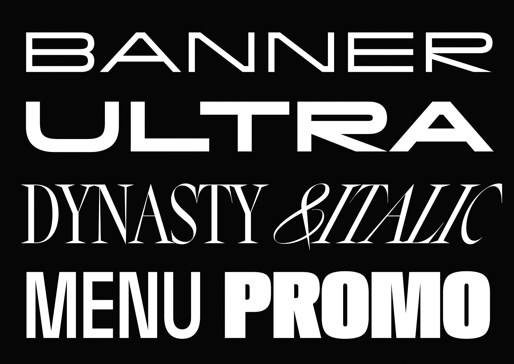
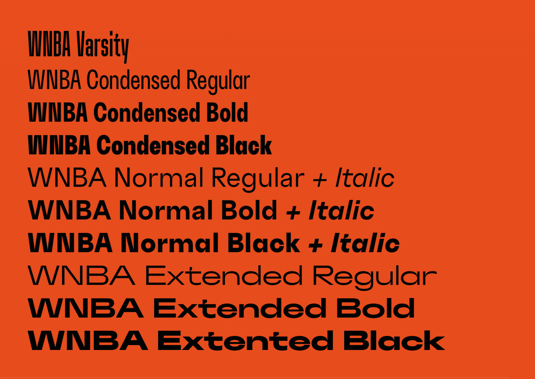
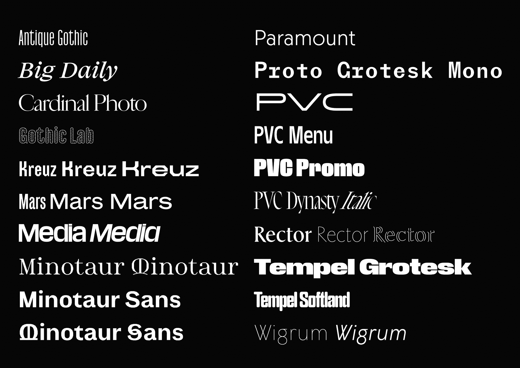
Since 2017, the ongoing collaboration betwenn sign painter Hélène Marian and Production Type has produced a captivating collection of typefaces, translating her sketches into a unique typographic realm that respects her artistic roots while charting new creative territory. My role in this journey involved active participation in feedback sessions and discussions, enriching the evolution of each typeface. This collection exemplifies the power of shared vision in creative collaboration. The trust we build with Hélène while working on PVC extended to a custom type system for the WNBA. Commissioned by Sylvain Labs, I accompanied Hélène along this project by giving design, and technical feedbacks.
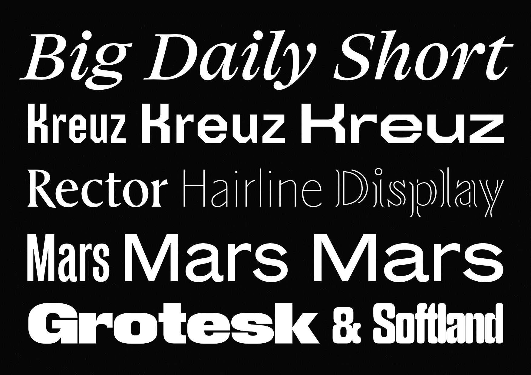
My involvement is twofold: in the design realm, I played a role by offering practical design assistance. Working closely with the designers, I shared ideas and feedback that helped shape the typefaces. In certain projects, I undertook the responsibility of expanding the character set, in addition to my involvement in tasks such as kerning, quality assurance, and font engineering. My commitment encompassed ensuring that the fonts adhered to essential quality standards. Displayed typefaces: Rector, Tempel Grotesk & Tempel Softland, Big Daily, Mars, Kreuz.

Expanding an existing retail typeface family required the creation of new members from scratch, leveraging a comprehensive understanding of the original design. Simultaneously, this endeavor involved the extension of character set support.

I led efforts to ensure the technical quality for our published typefaces, focusing on practical solutions. I designed and implemented a range of tools, including detailed quality reports and handy Python scripts. These tools were specifically crafted to match the needs of different projects, significantly ramping up our efficiency. The custom processing tools I developed played a crucial role in speeding up project timelines while maintaining high standards of workmanship.
Magnetic Metrics
Production Type / Self-initiated
2020
Observer to make sidebearings magnetic to outline modifications. Its aim to be used as a startup script so it can be activated and deactivated whenever you need. Get it on Github

Hotline Glyphs
Production Type / Self-initiated
2020
A small extension to preview other fonts in the glyph view. Get it on Github
PT Hud Context
Production Type / Self-initiated
2020
The extension adds context to your glyph window using RoboHUD from Tal Leming. Get it on Github

Composite Tool
Production Type / Self-initiated
2020
Selection tool which moves the base glyph anchor from the selected composite. Get it on Github